Responsive Images Explained: Why One Image Size Is Not Always Enough
ImageRW Guide · Practical image workflow
Responsive image delivery is about matching the resource to the layout rather than sending the largest possible image to every device.
Quick takeaways
- Different display widths can justify different image resources.
- Responsive markup does not fix an oversized source by itself.
- Test the rendered page and selected resources on real devices.
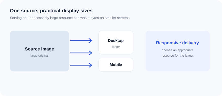
Original ImageRW diagram: Responsive Images Explained: Why One Image Size Is Not Always Enough.
Different layouts need different resources
A desktop hero might be wide while a mobile layout uses a much narrower display. Delivering a huge source to every screen can waste bytes.
Pixel dimensions still matter
Responsive markup does not make an oversized source free. The browser still has to download the selected resource.
Keep the composition useful
A mobile crop may need a different focal point from a desktop image. Responsive images can involve both different sizes and different crops.
Combine with sensible compression
Each responsive variant should be optimized for its intended display size. Creating several enormous variants defeats the purpose.
Test on real pages
Inspect the actual rendered layout and network behavior rather than optimizing images in isolation.
A simple HTML pattern
<img src="photo-1200.jpg"
     srcset="photo-600.jpg 600w, photo-1200.jpg 1200w"
     sizes="(max-width: 700px) 100vw, 70vw"
     alt="Example product photo">
The exact widths should come from the real layout. The important idea is to give the browser multiple useful resources rather than serving one oversized image to every screen.
Frequently asked questions
Do I need different crops for mobile?
Not always, but a different crop can be useful when the subject would otherwise become too small or poorly positioned.
Are responsive images only for mobile?
No. They can help any layout with substantially different display sizes.
Does responsive delivery guarantee faster pages?
It can reduce unnecessary image bytes, but total page performance also depends on scripts, fonts, caching and other resources.
Image content varies. Test representative files, keep the original and judge the output in the context where people will actually see it.